
UI
UI is a Modifier
Section titled “UI is a Modifier”UI exists within a World, and is attached to an Entity like other modifiers.
When you create a UI on an Entity, you’re creating a canvas.
A canvas is an isolated space, dedicated to elements within that canvas.
These UI elements are called controls, a canvas is a container for controls. UI controls don’t belong to the world (they are not entities), they belong to the canvas. We’ll see how that looks below.
A canvas also has it’s own coordinate space, where 0, 0 is top left for the origin,
and Y values increase downward. This is different from world space, where Y+ is up.
UI from code
Section titled “UI from code”To create a UI, we need an entity to attach it to.
When we attach the UI, we also give it a camera, which it will use to calculate input. That means if your object is in a 3D world, input should work as expected without extra effort.
var canvas = Entity.create(world, "ui")var x = 0var y = 0var w = 500 //these are in world unitsvar h = 500var depth = 0UI.create(canvas, x, y, w, h, depth, camera)Creating a control
Section titled “Creating a control”Now that we have a canvas, we can create controls inside it.
Controls are positioned relative to the canvas unless they’re a child of another control. Let’s create a panel, as a background, so we can see our canvas.
To create a control, we pass in the canvas that it will be created in. Once created, we can configure it.
We’ll tell it to fill the entire canvas by using the fill behaviour.
var bg = UIPanel.create(canvas)Control.set_behave(bg, UIBehave.fill)UIPanel.set_color(bg, Color.pink)So here we can see that we got a panel control in return from create.
This value is an instance of a control that belongs to this canvas.
Commit
Section titled “Commit”Now that we’ve made several changes to the UI, we should commit them.
UI.commit(canvas)Controls and Specialized Controls
Section titled “Controls and Specialized Controls”All controls are a Control, but not all controls are a UIPanel.
Controls like UIPanel specialize a control, and offer their own API
on top of the Control API, like UIPanel.set_color. The Control API
is valid for all controls, regardless of their type, but specialized controls
only work with the same API that their create function is from.
All this means is that the Control API offers a lot of the foundations, and distinct types have extra functions on top.
Control events
Section titled “Control events”Let’s add a button as a child of our panel, and listen for interaction. We’ll center it andgive it a fixed size this time.
var button = UIButton.create(canvas)UIButton.set_text(button, "click!")Control.set_behave(button, UIBehave.center)Control.set_size(button, 128, 32)Control.child_add(bg, button)When we have a control, we can listen for events on that control and respond to them as needed.
Like our button will have a UIEvent.release event when clicked.
Control.set_events(button) {|event| if(event.type == UIEvent.release) { Log.print("The button was clicked! x %(event.x) y %(event.y)") }}You can also print the event to see what kind of events are happening and when:
Control.set_events(button) {|event| Log.print("event from button %(event)")}Empty controls as containers
Section titled “Empty controls as containers”An empty control is created like this:
var container = Control.create(canvas)This control has all the same tools as any other, like layout, events and can be used as a container to organize other controls in the layout. Containers will also clean up their children, so if you destroy a container it’ll clean up all the contents.
Debug Visualization
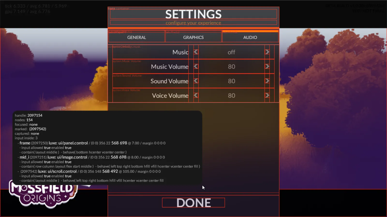
Section titled “Debug Visualization”In your settings file (like outline/settings.settings.lx), we can specify a debug flag
that will draw outlines for each control, and show some info about what controls are hovered.
Inside the settings file, put engine.ui.debug_vis = true at the root.
You can also control it per UI using UI.set_debug_mode(canvas, UIDebugMode.basic) which is useful when you have multiple UI layers,
and allows you to toggle it at runtime for debugging in game.
Also relevant: A Control doesn’t have a name by default, you have to set one using Control.set_id(control, "some name").
UI flex layout
Section titled “UI flex layout”In games you typically don’t want to hardcode UI layout, so luxe has flexible layout enabled by default. Layout only requires 3 API functions on a control to be useful:
Control.set_behave(control: Control, behave: UIBehave)Control.set_contain(control: Control, contain: UIContain)Control.set_margin(control: Control, left: Num, top: Num, right: Num, bottom: Num)Flex concept: Margins
Section titled “Flex concept: Margins”An example: A label that fills its container, it has a left/right margin so it isn’t right against the edges.
Flex concept: Contain
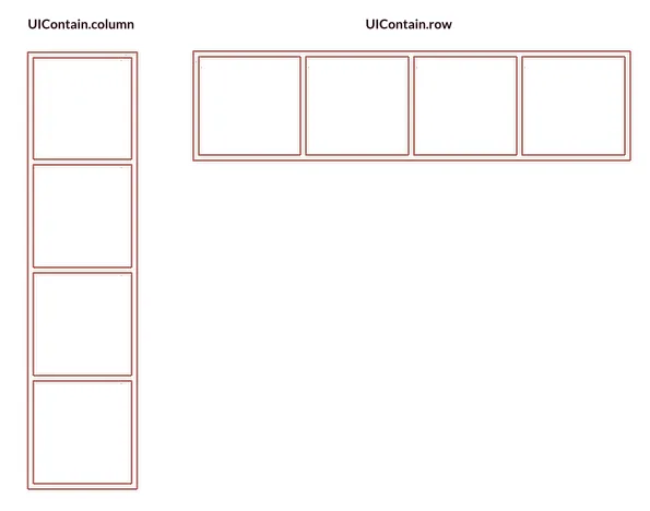
Section titled “Flex concept: Contain”- Column - A vertical stack. Each child added will be vertically arranged.
- Row - A horizontal stack. Each child will be arranged horizontally, but can wrap.
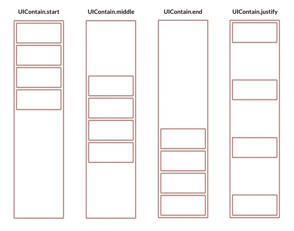
You can also choose whether items are arranged from the start or end of the container, or spread out.
Flags can combine, for example Control.set_contain(control, UIContain.row | UIContain.start).
Not all flags combine in a meaningful way!
Wrapping
Section titled “Wrapping”UIContain.wrap and UIContain.nowrap allow specifying what will happen if the container gets too small for the contents.
Wrap will push items onto the next line!
Fit contents
Section titled “Fit contents”Sometimes we want the container to be the size of it’s children.
This is the default, but we can enforce it with UIContain.hfit or UIContain.vfit.
UIContain.layout
Section titled “UIContain.layout”If the contain flags contain layout as an option, it means that controls use their margin as positioning, and controls aren’t relative to each other.
An example: Sticky notes on a board that you can arrange at will. They don’t affect each other like column/row would.
Keep in mind: If the contents rely on the parent size, and the parent size relies on the children, the behaviour is not well defined and confusing things can happen.
Flex concept: Behave
Section titled “Flex concept: Behave”Once arranged inside a container, a control can control how it behaves.
Flags can combine, for example Control.set_behave(control, UIBehave.top | UIBehave.left).
Not all behave options work in all contain modes, and not all flags combine in a meaningful way.
Fill flags
Section titled “Fill flags”UIBehave.fill- will expand to take as much space as it canUIBehave.hfill- will expand to take as much space as it can horizontallyUIBehave.vfill- will expand to take as much space as it can vertically
When setting a fill mode, you set the size to 0 which means “the size is calculated by layout”. Like in the example below, the size is fixed height, but width is flexible.
Control.set_behave(control, UIBehave.hfill)Control.set_size(control, 0, 32)Align flags
Section titled “Align flags”We can choose how a control anchors to the parent edges:
UIBehave.left- will anchor to the left edge of the parentUIBehave.right- will anchor to the right edge of the parentUIBehave.top- will anchor to the top edge of the parentUIBehave.bottom- will anchor to the bottom edge of the parent
And we can center things:
UIBehave.center- will anchor to the center of the parent on both axesUIBehave.vcenter- will anchor to the center of the parent on vertical axisUIBehave.hcenter- will anchor to the center of the parent on horizontal axis
Example code
Section titled “Example code”(‘empty’ project outline)
import "luxe: io" for IOimport "luxe: math" for Mathimport "luxe: asset" for Assetimport "luxe: color" for Colorimport "luxe: input" for Input, Keyimport "luxe: world" for World, Entityimport "luxe: world" for UI, UIEvent, UIBehave, UIContain, UIDebugModeimport "luxe: assets" for Assets, Stringsimport "luxe: ui" for UIButton, Control, UILabel, UISlider, UIPanel
import "outline/ready" for Ready
class Game is Ready {
  construct ready() {
    super("ready! %(width) x %(height) @ %(scale)x")
    var canvas = Entity.create(world, "ui")    UI.create(canvas, 0, 0, width, height, 0, camera)    UI.set_debug_mode(canvas, UIDebugMode.basic)
    color = Color.white
    var bg = UIPanel.create(canvas)    Control.set_behave(bg, UIBehave.fill)    UIPanel.set_color(bg, Color.pink)
    UI.commit(canvas)
    //we'll use the ui w/h from above    var button = UIButton.create(canvas)    UIButton.set_text(button, "click!")    Control.set_behave(button, UIBehave.center)    Control.set_size(button, 128, 32)    Control.child_add(bg, button)
    Control.set_events(button) {|event|      if(event.type == UIEvent.release) {        Log.print("The button was clicked! x %(event.x) y %(event.y)")      }    }
  } //ready
  tick(all_delta: Num) {
    if(Input.key_state_released(Key.escape)) {      IO.shutdown()    }
  } //tick
} //Game